Mobile phones have become an indispensable part of our lives. They’re used as a music player or a book in transport, as a camera for travel, and even as a notebook in the office. We wake up with an alarm clock installed on our device and fall asleep chatting in the messenger, which remains open on our phone’s screen during the day. We’re modern, we’re social, we’re dependent on the Internet and smartphones.
So why some SEO specialists forget about mobile traffic, which can easily compete with desktop one or even exceed it for some industries? As a rule, we appreciate the total volume of the organic traffic and don’t feel the necessity to divide it into separate parts. It’s an absolutely incorrect approach to optimization, which can be successful only in the case of the interaction of all elements. So, if you continue to believe that mobile-friendly websites aren’t efficient for some web sources that provide specific information, services or products, you should change your mind.
Why Is It So Important
Google started to recognize the mobile-friendliness as one of the ranking factors since April 2016. That’s the principal reason to reconsider and work on the increase of the visitor’s number on your pages in terms of the mobile channel. In order to attract the “mobile” audience, you should take care of the mobile-friendly and responsive design. It should be understood not only as the accessibility of the content on your website to visitors on different devices, including desktop, tablet, and mobile but also as usability, which means the comfortable, efficient and satisfying experience for the users.
First of all, we suggest using a Mobile-Friendly Test, which helps you to get a short analysis of individual pages on your website, find out the initial problems and show the way to solve them.
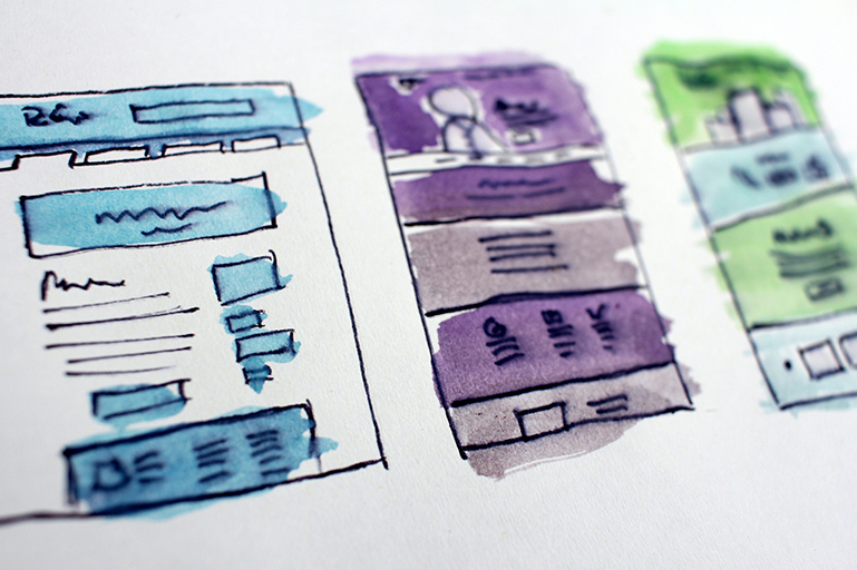
The main secret of a great mobile website design consists of your understanding and correspondence with your users and their intent. Keep in mind that you target goal-oriented and time-limited people who are used to receiving information immediately and aren’t going to waste their time on excessive actions.
How to Achieve Responsive Mobile Website Design?
Follow the principles below to be on the same wavelength with your users:
1. Try It Yourself
As we live in a period of wide socialization, you need to be sure that your mobile-optimized website supports the possibility for users to share your unique content with their followers and let the ranking to the highest positions. To create a decent responsive and mobile website design, surf the web from your portable device and look through the websites in different niches as a typical user, but not as a kind of critical one.
2. Simpleness
It is the best way to make a well-organized data structure and a comprehensible, accessible interface. Just imagine how annoyed your users could get when scrolling through the endless options listing in search of the one they need. Include the essential items in the main menu to organize easy navigation on your website. Also, take care of your on-the-go visitors and place the search bar in the beginning to identify the user’s intent, give the shortest path towards their goal, and satisfy them as soon as possible.
During the development of the mobile design, don’t forget about the main user patterns. Remember that selecting big and visible buttons, especially the call-to-action ones, is a perfect decision to tap with your finger on a mobile screen. At the same time, keep in mind the design and style of your original website. For this purpose, use the responsive layout, which changes depending on the size and capabilities of the user device, to turn the mobile web page design into a simpler version of the desktop one. Try to make the mobile design for your website as clear as possible: short-cut the headings and descriptions.
The main benefit of the responsive mobile website design is that the visitors do not need to zoom in on the pages while browsing from their devices or look through the awkwardly displaying pages, so don’t neglect that.
Pay extra attention to the mobile homepage design, which ideally presents the greatest part of the significant content. Actually, the homepage on the mobile web version should contain a common solution for visitors. For instance, the contacts and the menus need to be shown on the restaurant’s and pizzeria’s homepage. Or if you manage a retail store, give people the chance to enjoy shopping and push them directly to the hierarchical-structured catalog with the matching filters to avoid the mass rolling out to your users.
3. Visualization
Visualization is an easy method to overcome misunderstandings between the website and your users. Professional design techniques are applied to improve visual perception. Moreover, the color contrasts will help manage the person's behavior, place emphasis, and even encourage intuitive actions.
Find the matching thumbnails and the familiar icons for the menu options and other navigation buttons to create both compact and descriptive mobile site design. Visualized information provides faster and brighter reflection. That's why you should replace the long text content with single images or collages where it's possible. Considering that the complex design components might badly influence the loading speed, keeping the balance between these two tactics is important.
4. Friendliness to the Audience
Friendliness to the audience is the crucial step to the high level of visitors’ trust in your source, which affords a smooth experience with your mobile site design and establishes long-standing cooperation. We firmly insist on a respectful attitude to the readers that never includes intrusive push notifications or other unexpected elements that force them to register or subscribe, especially during the first visit.
5. Functionality
Last but not least, a factor that affects mobile phone web design – is the functionality. Running the experiments with the external view, remember that your source should contain an up-to-date set of functions. For example, it will be really convenient for your visitors to save the items into the wishlist or download the information package to the device to look through it later.
Alex Sheplyakov
Chief Technology Officer
Being passionate about all things tech, I convert vast working knowledge of software architecture and designing scaled solutions into easily-digestible posts. Stay up to date on the latest and greatest in the tech world. If you want to keep in touch, follow me on LinkedIn.