Shopping cart abandonment: 5 steps to win your customers back
The rise of eCommerce businesses as an essential part of the modern market has made online shopping almost as widespread as regular offline purchasing. This has greatly changed the relationship between the seller and the buyer, and brought on new challenges that need to be addressed by marketing.
One of the issues with online shopping for eCommerce businesses is shopping cart abandonment - an incredibly frequent occurrence where a customer forms a cart, but leaves the platform without completing a purchase.
Why could shopping cart abandonment be a problem for an online retailer?
Despite the fact that the exact percentage of abandoned shopping carts depends on the type of business and audience, it is substantial for any kind of eCommerce platform.
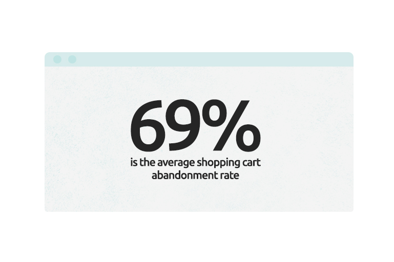
Based on Baymard Institute's 2019 research, the average cart abandonment rate is 69.57%.
This illustrates how most of the people attracted by advertising campaigns to a website do not convert into buyers, which leads not only to loss of potential revenue from the purchase, but also no return on funds spent on promotional activities.
What steps can a retailer take to reduce shopping cart abandonment?
To answer this question, you need to understand the reasons that cause buyers to check out halfway.
The reasons for leaving the shopping cart can be divided into two groups - those that depend on the retailer, and those that are out of your control.
Unfortunately, we cannot avoid or actively work against the second group, as there will always be some percentage of people who add items to the shopping cart without planning to purchase, or doing so on accident. It’s pretty much impossible to persuade them to finalize that sale through any promotional means, but thankfully these cases do not represent the majority of shopping cart abandonment issues.
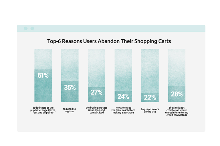
Concerning the first group, which can be remedied through the business’s efforts, the Baymand Institute has collected some statistics on the main reasons for shopping cart abandonment.
So, what shopping cart abandonment solutions are out there, and which ones are the most effective?
Based on the available data, you can take these 5 steps to help establish contact with the client and significantly reduce the level of shopping cart abandonment in a relatively short time.
Step 1. Make sure that your site can be used quickly and conveniently.
First of all, the site must be optimized for any mobile device to work quickly. The modern Internet user is not patient - if you keep the buyer waiting for the page to load too long, you will lose them. Think about this when you choose images and animations for your website.
Secondly, make the registration process as easy as possible, or provide the option of purchasing as a guest.
Registering a user on the site is useful - you are able to collect customer data, follow their preferences, send letters, select individual offers, and reach out to remind them about your website.
But the obligation to register during checkout can be annoying to the visitor and often leads to an abandoned cart. It is better to refrain from asking for mandatory registration, but if you want to keep the user ‘sign up’ feature, here are two options for making it less intrusive:
- Let the user enter only a name, mail and password, without obligatory confirmation - leave this for later. A good alternative is to let them register through social networks.
- Give them a choice - for example, a bright "Sign up" button and aless visible "Checkout without registration". Those in a rush will notice the second option, and the rest will proceed to register.
And, of course, the main thing is the payment process. It should be convenient and easy for the user to spend their money in your online store. The longer this step takes, the lesser their drive to complete the order becomes.
It is important to reduce the number of stages of ordering to the absolute minimum. A linear progress indicator will also help to keep the buyer on the same page as to how much longer the prideas will take.
It is not recommended to split the payment process into more than five stages, so as not to reduce the conversion of the online store.
Do not forget to add several payment methods - different bank cards, e-wallets or cash on delivery; this will expand the list of options for buyers and make the decision purchase easier.
Step 2. Get rid of unpleasant surprises at the purchase stage.
Unexpected shipping costs are one of the main reasons for abandoning a purchase. Do not confuse the buyer and immediately indicate the possible rise in price for their items due to additional charges.
The best option is to list all additional costs (shipping, taxes) directly on the product page or link to a separate page with this information. Then, the buyer will know the final cost before placing the order and will not be put off by the final bill.
If the shipping cost does not depend on the buyer’s location, try including it in the price of the item right away. Fixed prices free the customer from having to do math and experiencing difficulties with figuring out the end price.
Add several delivery options that differ in cost and speed, which will give the buyer an opportunity to customize it to suit their needs and budget constraints. Some people may want to save their money, but others prefer to pay more for faster shipment.
Free shipping as a reward is a great bait that will not only push them to buy, but also motivate the buyer to return to your shop for a new order.
Step 3. Build trust between yourself and the buyer.
Non-secure payments are a very typical reason for shopping cart abandonment. Buyers want their personal information to stay safe and avoid future non-consensual charges.
Add payment operator logos and trust signals such as MasterCard SecureCode/Verified by Visa to your website to show customers that it is safe to buy from you.
Customers like to shop on sites they feel they can trust, so another tip is to add customer reviews. With secure payment processes and other people's recommendations, you can expect both an increase in Average Order Value and an improvement in Customer Retention.
Also, an important detail is a flexible and understandable return system. When ordering a product on the Internet, the user faces many doubts about the quality of the product. The more comfortable the conditions for the refund is, the more confidence and peace of mind the buyer has at the payment stage.
Step 4. Maintain customer motivation throughout the entire purchasing process.
The image is the main way for the buyer to get acquainted with the product. Beautiful and detailed pictures in the catalog are an essential part of a product presentation. Additionally, don't neglect the thumbnail pictures in the shopping cart. They will serve as a visual reminder of what the buyer is planning to purchase, create additional motivation and enrich the shopping cart design.
In regards to more useful additions to the website, it's worth mentioning the Call-to-Action (CTA).
CTA is a graphic element that motivates and encourages site visitors to take a specific action, which in our case is making a final purchase. CTA elements on the website should be noticeable on the page so that a person immediately directs their attention to the call-to-actions.
The most popular CTA elements are buttons that aim to make the user perform specific actions. In our case, this button should be present in the catalog, on the product page and in the shopping cart, with a phrase motivating the buyer to “buy” or “pay”.
People love various discounts, sales and promotions. Therefore, it is only natural that adding items to the cart is just a way for them to check the total amount of the order. This is why it is so important to have a strategy for dealing with clients that have an intention of leaving the site.
The main part of such a strategy is to provide users with some value proposition right before they try to leave your store page. Check-out process is a moment when you still can change the situation.
This is where the so-called exit-popups come into play. They may suggest:
- Discounts
- Contests or the opportunity to win a prize
- Free shipping
- Content to download
Analyze your target audience’s behavior: what are users looking for, and how can you get them to stay? You don't need to implement exit pop-ups on every page of your site, but you should consider adding them to:
- Product Pages
- Search Result Pages
- Checkout page
- Any page indicating the user is delving into your content and there is some likelihood of a purchase.
Step 5. Don't lose contact with the ‘abandoners’.
What to do with ‘abandoners’ and incomplete purchases?
If a client has registered on your online store and subscribed to the newsletter, then you have an official opportunity to contact them via email. Use email marketing automation services to send reminders of pending purchases. A friendly hint doesn't hurt, just make sure your message stands out:
- Has a "catchy" theme;
- Mentions one specific (popular) product;
- Written creatively;
- Offers a discount (but be careful with this, otherwise customers will start deliberately leaving their baskets in the hope of getting a lower price);
- Reminds you of the points accumulated in the bonus program and offers the opportunity to use them.
Another great strategy for communicating with the client after they’ve abandoned the shopping cart is retargeting.
The essence of retargeting is that you serve ads to people who have already visited your store.
If a customer had added a product to the cart, but did not end up buying, reach out to them with ads that mention this product and an invitation to the store through websites, social networks and applications your customer uses.
In the process of creating such ads and using remarketing (retargeting), think about what you know about your customers and their behavior. Do they abandon their carts during the first or fourth checkout step? What micro-conversions do you see during this whole process? Use this information to create the best possible advertising message and thus reduce cart abandonment.
Examples of such advertisements include:
- Announcing the items will be sold out soon;
- The number of such items remaining in the warehouse;
- A reminder that they will receive this item before a certain date or holiday, for example, before the New Year;
- 10% discount if ordered right now;
- Free delivery on the order;
- Special discount coupon for orders within the next 12 hours.
Naturally, depending on the specifics and type of your business, you can create other types of messages in order to motivate the client to return to the forgotten cart.
Decreasing shopping cart abandonment is a very important aspect on the road to the success of your eCommerce business. By consistently implementing these 5 steps, you will be able to improve the performance of your project and increase customer conversion. If you find this process rather challenging, you are welcome to reach out to WiserBrand eCommerce consulting experts and get a solution now.
