Business Intelligence Dashboards: What Metrics Actually Matter


A business intelligence dashboard earns its place when a named person opens it, sees what changed, and knows what to do next. Many dashboards never reach that point. They show a wall of accurate charts that nobody acts on.
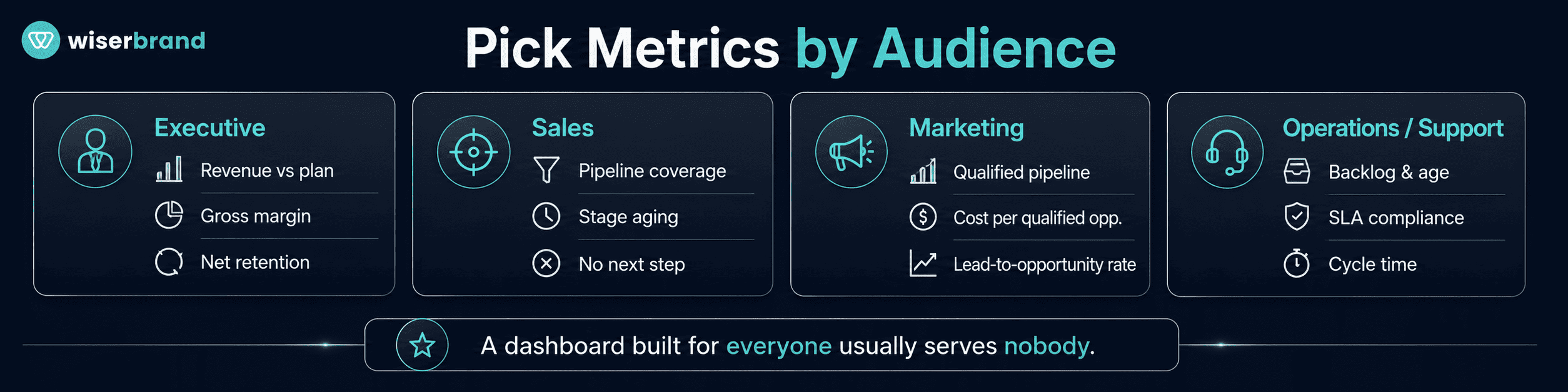
The useful question is which metrics change a decision. A CEO deciding where to place next quarter’s investment needs a different screen than a support lead deciding where to assign agents this morning. A dashboard built for everyone usually serves nobody.
Metrics that matter on business intelligence dashboards share three properties. They connect to a decision someone can make. They carry a definition every team calculates the same way. They have an owner who responds when the number moves.
This guide covers what business intelligence dashboards are, which metrics belong on them by business function, how to specify a metric so teams trust it, when a dashboard is the wrong tool, and how to avoid the design choices that make a polished dashboard useless.
What Are Business Intelligence Dashboards?
Business intelligence dashboards are visual reporting tools that let teams track, analyze, and act on business metrics in one place. They combine KPI cards, charts, tables, filters, and alerts, usually on top of data pulled from several source systems on a refresh schedule.
Qlik describes a BI dashboard as a business intelligence tool that allows users to track, analyze, and report on key performance indicators and other metrics. The mechanics matter more than the definition. A dashboard reads from a source on a set cadence, applies agreed calculations, and presents the result to a specific audience.
A dashboard is not a report. Microsoft’s Power BI documentation describes a dashboard as a single page, often called a canvas, that tells a story through visualizations, and notes that a well-designed dashboard contains only the highlights of that story while readers open related reports for the detail.
That distinction sets the rule for everything below. The dashboard carries the signals that deserve attention now. The report carries the explanation.
Why Many BI Dashboards Fail
Dashboards usually fail for a structural reason rather than a visual one. They get built from the data that happens to be available instead of the decisions the audience actually makes.
One view might show revenue, traffic, leads, meetings, tickets, churn, inventory, cost, and campaign performance. Coverage looks complete. The user still has to work out which number matters, what moved, why it moved, and who should respond.
Common problems include:
- Too many metrics on one screen.
- No defined audience.
- No owner attached to any KPI.
- Activity measured without outcomes, or outcomes without drivers.
- No target, benchmark, or trend to judge the number against.
- Conflicting definitions between teams.
- Refresh timing that arrives after the decision window closes.
- Charts that look finished and answer nothing.
Tableau’s dashboard guidance reaches a similar conclusion from the design side: a visualization needs a clear purpose and a known audience, and adding too many views costs both visual clarity and the big picture.
The fix is not a better chart library. It is deciding what the screen is for.
What Metrics Actually Matter?
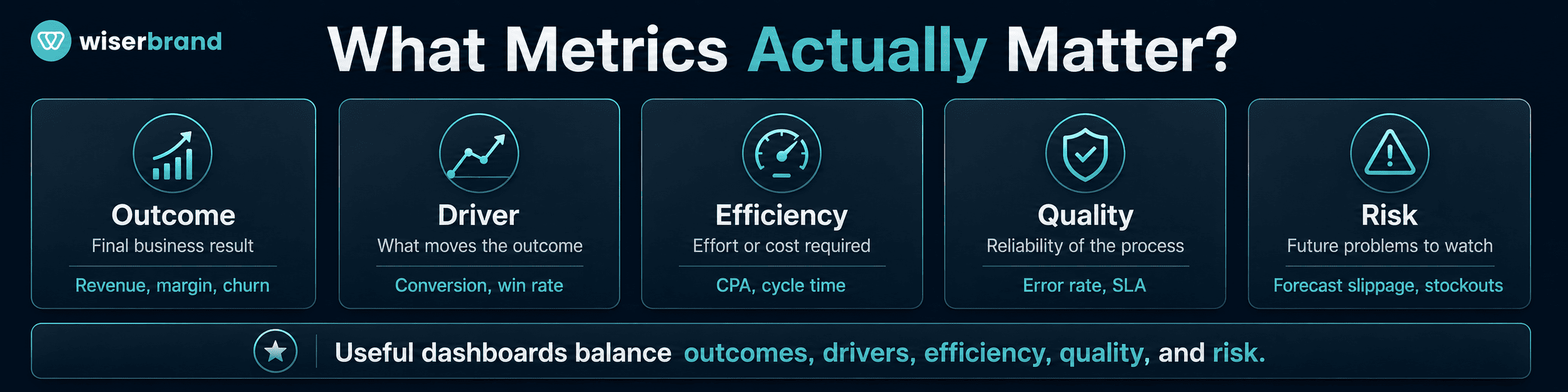
The metrics worth displaying help a team understand performance, explain change, and choose an action. Five categories cover most business dashboards.
| Metric Type | What It Measures | Example |
|---|---|---|
| Outcome metric | The final business result | Revenue, margin, churn, retention |
| Driver metric | What moves the outcome | Conversion rate, win rate, lead quality |
| Efficiency metric | Effort or cost required | Cost per acquisition, cycle time, utilization |
| Quality metric | Reliability of the process | Error rate, SLA compliance, return rate |
| Risk metric | Conditions that create future problems | Forecast slippage, overdue invoices, stockouts |
Balance across these categories is what makes business intelligence dashboards useful. Outcome metrics alone report the result after the period is decided. Activity metrics alone reward busywork.
A sales dashboard showing only closed revenue illustrates the gap. Add pipeline coverage, win rate, stage aging, and next-step completeness, and a manager can intervene in week four rather than explain the miss in week thirteen.
Define the Metric Before You Display It
Most dashboard arguments are definition arguments. Two teams report different qualified-lead counts, the meeting turns into a reconciliation exercise, and the underlying decision gets postponed.
A clear metric model is a core part of data strategy consulting. Specify each metric before it reaches a screen:
| Element | Question It Answers | Example: Qualified Leads |
|---|---|---|
| Definition | What exactly counts? | Contacts meeting the agreed fit and intent criteria, accepted by sales |
| Source system | Which system is the source of truth? | The CRM, not the marketing automation platform |
| Refresh | How current is the number? | Hourly sync, with the timestamp shown on the tile |
| Comparison | Against what? | Prior four-week average and the quarterly target |
| Threshold | What counts as normal, concerning, or urgent? | Below 80% of the weekly target for two consecutive weeks |
| Owner | Who responds when it moves? | Demand generation manager |
| Action | What happens at the threshold? | Channel mix review with sales within five working days |
A metric without a threshold is decoration. A threshold without an owner is a notification nobody answers.
Executive Dashboard Metrics
An executive dashboard should answer three questions on the first screen: are we on track, what changed, and where should leadership spend attention. Departmental detail belongs one click down.
| Metric | Decision It Supports |
|---|---|
| Revenue against plan | Reforecasting, budget reallocation, or a targeted intervention |
| Gross margin | Pricing, discounting, and cost-to-serve review |
| Cash position and burn | Hiring pace, capital spend, and financing timing |
| Acquisition cost against lifetime value | Where to add or withdraw growth investment |
| Churn or net retention | Where the constraint sits: acquisition or the installed base |
| Pipeline coverage | Demand generation versus execution focus for next quarter |
| Initiative status against milestone | Which programs keep funding and attention |
Leaving material off this screen is part of the design. Campaign-level performance, individual rep activity, ticket queues, and system uptime belong on the dashboards of the people who act on them daily. An executive who needs that detail should reach it through a drill path, not through permanent screen space.
Sales Dashboard Metrics
A sales dashboard is a coaching instrument before it is a reporting instrument. Its job is to surface the deals and behaviors a manager can still influence.
| Metric | Decision It Supports |
|---|---|
| New pipeline created | Changes to demand generation before a coverage gap appears |
| Pipeline coverage by segment | Where to shift rep capacity or campaign spend |
| Win rate by stage | Which stage needs coaching or tighter qualification |
| Stage aging | Which deals to inspect this week |
| Opportunities with no next step | Which reps need pipeline hygiene follow-up |
| Forecast category movement | How much weight to put on the commit number |
| Lost reason trends | Which pattern to address: price, product, timing, or competitor |
Separating leading from lagging signals is what makes the difference. Closed revenue is settled history. Stage aging, next-step completeness, and forecast movement are visible while the quarter is still open, which is the only period when a manager can change the result.
Marketing Dashboard Metrics
A marketing dashboard should connect spend to qualified demand. Consumer data intelligence can bring customer behavior, acquisition, conversion, retention, and segment data into a shared analytical view. Traffic, impressions, and clicks belong on it only where they explain a change in acquisition cost or conversion.
| Metric | Decision It Supports |
|---|---|
| Qualified pipeline by channel | Where to move budget next month |
| Cost per qualified opportunity | Which channels to scale, hold, or pause |
| Lead-to-opportunity rate | A volume fix or a targeting fix |
| Marketing-sourced and influenced revenue | How to credit and fund programs |
| Conversion rate on high-intent pages | Which pages to test or rewrite |
| Time from inquiry to first contact | Changes to routing or the response SLA |
| Campaign payback period | Campaign renewal or retirement |
The failure mode here is a dashboard that celebrates volume while quality falls. Traffic up, qualified pipeline down is a common and expensive pattern, and it stays invisible when the screen carries only top-of-funnel counts.
Attribution deserves one explicit decision. Sourced, influenced, first-touch, and multi-touch models produce different numbers from the same data, so fix the model and the lookback window before comparing periods, and label the model on the dashboard itself.
Finance Dashboard Metrics
A finance dashboard turns periodic reporting into something a leader can act on mid-period. Its value comes from exceptions rather than completeness.
| Metric | Decision It Supports |
|---|---|
| Revenue against budget by line | Where to adjust spending authority |
| Gross margin by product or customer | Pricing and mix decisions |
| Operating expense against plan | Which cost centers need review |
| Cash flow and runway | Timing of hiring, purchasing, and financing |
| Receivable aging and days sales outstanding | Which accounts to escalate to collections |
| Budget variance above threshold | Which owner explains and corrects the gap |
| Forecast accuracy by owner | How much confidence the next forecast earns |
Build the screen around variance thresholds rather than full ledgers. A variance table, a trend line, and an exception list usually beat a dense grid of charts, because each row already names a person and a required response.
Operations Dashboard Metrics
Operations dashboards answer where the work is stuck and what is at risk of breaching a commitment.
| Metric | Decision It Supports |
|---|---|
| Cycle time by stage | Which step to fix first |
| Backlog volume and age | Adding capacity or reprioritizing the queue |
| SLA compliance by segment | Which commitments need intervention today |
| Exception rate by type | Which process rule or integration to change |
| Rework rate | Correcting speed gains that cost quality |
| Capacity utilization | Staffing and scheduling |
| On-time delivery | Proactive customer notification |
Status alone rarely produces action. “Backlog is rising” starts a discussion. “Backlog is rising because approval time in Region A doubled after the policy change” assigns one. Pair each status metric with the segment or step that explains it, and name the person who owns that step.
Customer Support Dashboard Metrics
A support dashboard has to balance speed against resolution quality. Optimizing either one alone produces predictable damage.
| Metric | Decision It Supports |
|---|---|
| Backlog by priority and age | Where to assign agents today |
| First response time against SLA | Shift coverage against demand patterns |
| Resolution time by category | Which issue types need documentation or a product fix |
| First-contact resolution | Agent access, tooling, and documentation gaps |
| Reopened tickets | Quality review of closed resolutions |
| Escalation rate by reason | Which policies or permissions block agents |
| Ticket volume by category | Which recurring issue to escalate to product or operations |
Read these as pairs. Falling response time next to rising reopens means work moved faster and finished worse. Falling escalation rate next to falling satisfaction can mean agents are closing cases they should have passed on.
Support data also has readers outside support. Repeated complaint categories point to product defects, unclear policies, billing confusion, or fulfillment problems, and those owners need the same view.
Product and eCommerce Dashboard Metrics
Product and ecommerce dashboards should show the quality of revenue alongside the volume of it.
| Metric | Decision It Supports |
|---|---|
| Conversion rate by device and source | Where to fix checkout or targeting |
| Cart abandonment by checkout step | Which step to test next |
| Revenue by product with return rate | Which products to promote, fix, or withdraw |
| Stockout and oversell rate | Purchasing and promotion timing |
| Repeat purchase rate by cohort | How much to spend on acquisition versus retention |
| Activation rate | Onboarding changes |
| Feature adoption by segment | What to build, document, or retire |
High revenue paired with high returns, frequent stockouts, or weak repeat purchase describes a problem, not a good quarter. For digital products, page views matter less than activation, depth of engagement, and renewal behavior, because those are the signals that appear before revenue confirms them.
How to Choose Metrics for Business Intelligence Dashboards
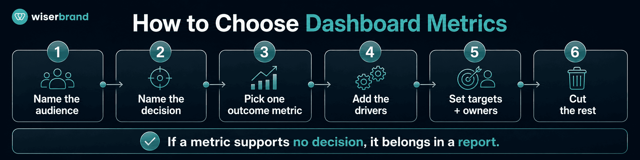
Metric selection follows the user and the decision, in that order.
- Name the audience. A CEO, a sales manager, a finance lead, and a > support director need separate screens.
- Name the decision. Write down what the user should be able to decide > after thirty seconds on the dashboard.
- Pick one outcome metric. Choose the result that matters most to that > decision.
- Add the drivers. Include the leading signals that explain why the > outcome is moving.
- Add the risk metrics. Show what threatens the next period.
- Set targets and comparison points. A number without a reference > cannot be judged.
- Assign owners. Every metric with a threshold needs a name against > it.
- Cut the rest. If a metric supports no decision, it belongs in a > report.
- Agree the definitions. Confirm that every team calculates each > metric the same way, and record the calculation.
- Review after launch. Remove what nobody opened.
Gartner’s marketing measurement guidance applies the same principle to one function: build stakeholder-specific dashboards that carry the outcomes relevant to that executive rather than the full channel picture. The logic generalizes. Useful dashboards are designed backward from the decision.
When a Dashboard Is the Wrong Tool
A dashboard suits recurring monitoring by a person who has time to look. Several common requests need something else.
- The response must happen within minutes. Use an alert or a work queue in the system where the work happens, not a screen someone might open.
- The output is a list of items to action. Use a filtered queue with assignment and status, so the work and the measurement stay in one place.
- The question is a one-time diagnosis. Run the analysis, write the answer, and skip the permanent view.
- The metric is reviewed monthly by one committee. A review pack costs less to maintain than a dashboard.
- Nobody owns the response. Fix ownership first, or the dashboard becomes a record of unattended problems.
Data freshness follows the same logic. A daily refresh serves a monthly planning cycle and fails an intraday operational decision. Match the refresh interval to the decision window, display the timestamp, and show the reader when a source last synced.
Dashboard Design Best Practices
The right metrics can still fail behind a bad layout. Design decides how much work the reader has to do before acting.
Tableau’s visual best practices recommend a logical layout, a simplified design, and interactive elements that are discoverable and predictable, with the most important view placed where the eye lands first.
| Rule | Practical Meaning |
|---|---|
| Lead with the main question | The purpose should be obvious without a caption. |
| Limit the first screen | Put the metrics that drive the decision above the fold. |
| Show trends | A current value means little without its history. |
| Show targets | Users need a reference point to judge the number against. |
| Show variance | Highlight change against plan, prior period, or benchmark. |
| Use filters carefully | Filters should support exploration without hiding the main message. |
| Label clearly | State the definition, unit, time period, and last refresh. |
| Show owners | Put a name next to the metrics that trigger action. |
| Cut decorative visuals | Every chart should answer a question someone asked. |
| Design for the device | A wallboard, a laptop, and a phone need different layouts. |
If a team needs a meeting to interpret the dashboard, the dashboard is unfinished.
Data Quality and Governance
Business intelligence dashboards are only as reliable as the sources behind them. Strong data engineering connects source systems, standardizes data, manages refresh pipelines, and gives dashboard users a consistent foundation for reporting. A clean chart built on unreliable data is more dangerous than no chart, because people act on it. Missing fields, duplicate records, inconsistent definitions, late refreshes, and manual spreadsheet edits all produce confident numbers that are wrong.
Practical governance for dashboards covers:
- A written definition and calculation for each metric.
- A named owner for each metric and each source.
- Documented source systems and refresh frequency.
- Validation checks with a visible failure state.
- Access controls for sensitive fields.
- Change history and version control for dashboard logic.
- A defined process for changing a definition.
- A periodic review that retires unused views.
Governance here means clarity rather than weight. If two teams define a qualified lead differently, the dashboard produces debate instead of alignment, and the debate recurs every month until someone writes the definition down.
Common Mistakes to Avoid
The root mistake is building from available data instead of business decisions. Most of the rest follow from it:
- Tracking metrics nobody owns.
- Mixing executive and operational views on one screen.
- Showing activity without outcomes, or outcomes without drivers.
- Publishing without targets or benchmarks.
- Leaving definitions implicit.
- Hiding data freshness.
- Adding charts because they look impressive.
- Treating launch as the end of the project.
Business intelligence dashboards also age. A view built for a twenty-person team rarely fits a two-hundred-person company, and a view built for one market breaks after expansion. Review them on a schedule, remove what nobody uses, and add metrics only when a real decision needs them.
FAQ
What Are Business Intelligence Dashboards?
Business intelligence dashboards are visual tools that let teams monitor, analyze, and act on business metrics. They combine KPI tiles, charts, filters, alerts, and drill paths over data from one or more source systems.
What Metrics Should a BI Dashboard Include?
A balanced set covers outcome, driver, efficiency, quality, and risk metrics. The exact mix depends on the audience and the decision, and each metric needs a definition, a comparison point, a threshold, and an owner.
How Many Metrics Should Be on a Dashboard?
Fewer than most teams expect. Five to ten primary metrics on the first screen, with detail behind filters or linked reports, works for most audiences. Tableau recommends limiting a single view to two or three visualizations before clarity suffers.
What Is the Difference Between a Dashboard and a Report?
A dashboard shows the signals that need attention in a compact view. A report carries the detail and explanation behind them. Microsoft’s Power BI documentation draws the same line: the dashboard holds the highlights, and related reports hold the rest.
How Fresh Does Dashboard Data Need to Be?
Match the refresh interval to the decision window. An intraday operational decision needs data that is minutes or hours old. A monthly budget review does not. Display the last refresh time so users can judge for themselves.
Why Do BI Dashboards Fail?
They fail when the screen has no defined audience, no owner, no thresholds, or no connection to a decision. Slow refresh cycles and conflicting metric definitions produce the same result.
How Often Should Dashboards Be Reviewed?
Review whenever the underlying process changes, with a quarterly cycle as the baseline. Gartner recommends revising dashboards and reports at least quarterly so they continue to meet stakeholder needs. High-volume operational dashboards usually need a shorter cycle.
Final Thoughts
The decision rule is simple to state and harder to hold: a metric belongs on a dashboard when a named person will act differently depending on its value. Everything else belongs in a report or nowhere.
The binding constraint is usually definitions, not tooling. Teams that cannot agree on what a qualified lead or an open ticket is will not be rescued by a better BI platform.
Start with one audience and one decision. Write the metric specifications, set the thresholds, assign the owners, and remove anything on the current screen that fails the test. Then repeat for the next audience.
If your dashboards look finished but decisions still happen in spreadsheets and status calls, our Data and AI team can help design the metric model behind your business intelligence dashboards, connect source systems, define KPIs, clean up reporting logic, and build views your teams use. For the workflow side of the same problem, see our guide on turning operational data into better business decisions.